
I have created 3 drafts of what my magazine might look like.
Design No.1
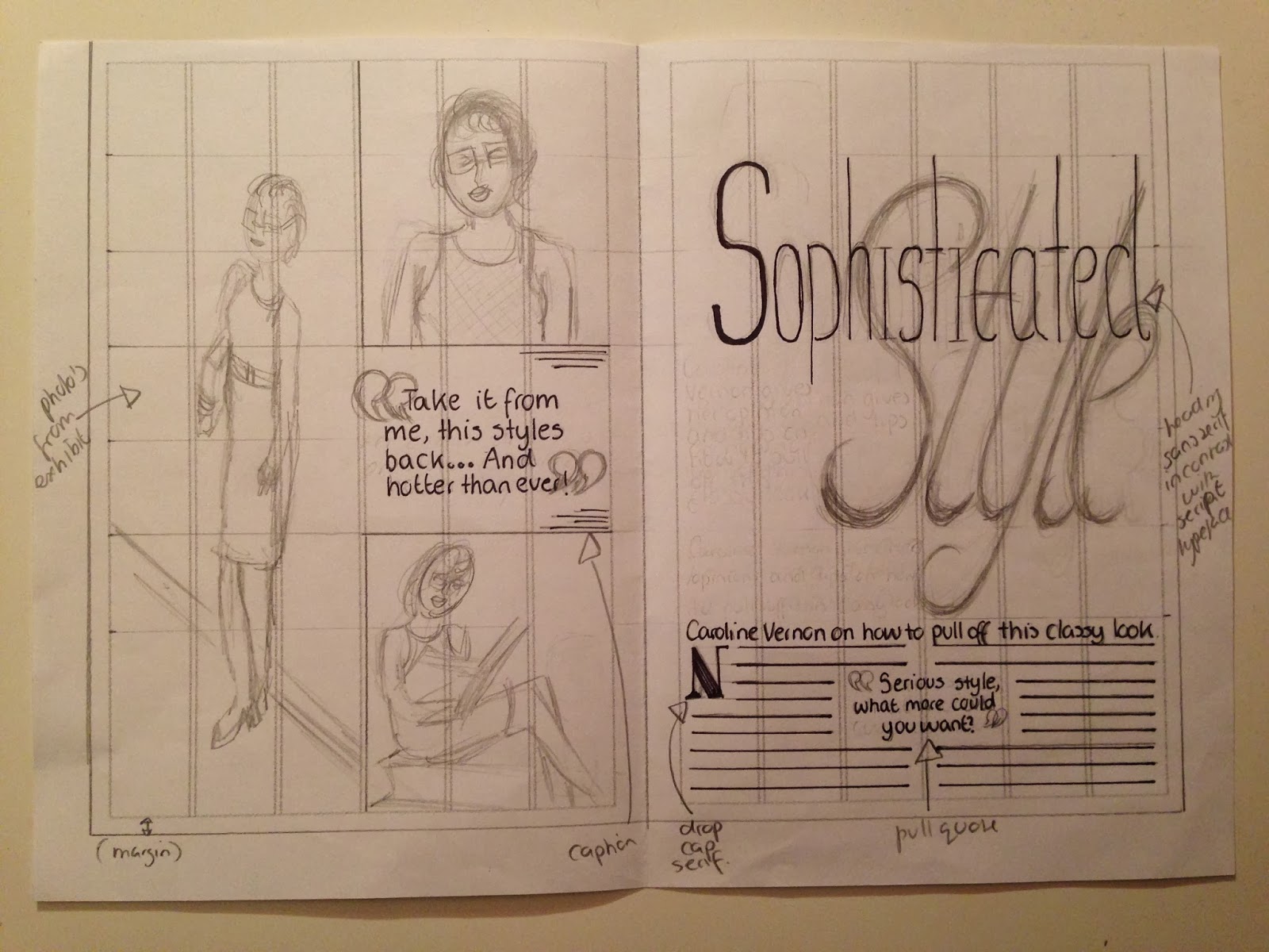
In this design i decided to do a large contrasting heading with the smaller body text. The heading itself also contrasts with each other as one word's typeface is a sans serif and the other a script. I also included pull quotes, a margin, a kicker, captions, photo's from my exhibit and also a drop cap to make it look more professional and appealing to the female audience. I also used whitespace and the photo's i will use will be helpful for women searching for tips.
Design No.2

In this design i have decided to use a continual serif heading, bleeding onto the next page. This helps link the photos to the story i created. I also used pull quotes, photos from my exhibit, a margin,a folio in the top left, a kicker, drop cap and captions for the photos explaining what they are. I also included a ampersand symbol slightly faded behind the heading to make the page more contrasting.
Design No.3

In this design i have chosen to place a large photo in the middle of my page, almost like a mirror of both sides. This helps link the two pages together easily. I also decided to make the heading sans serif to help intensify the feeling of sophistication but a modern style. I also included a kicker, a folio in the top left, pull quotes, drop caps, a margin and a caption to explain my photos. To help make the DPS more diverse i have also varied the size of images i have used.
No comments:
Post a Comment