Thursday 30 January 2014

Making of DPS


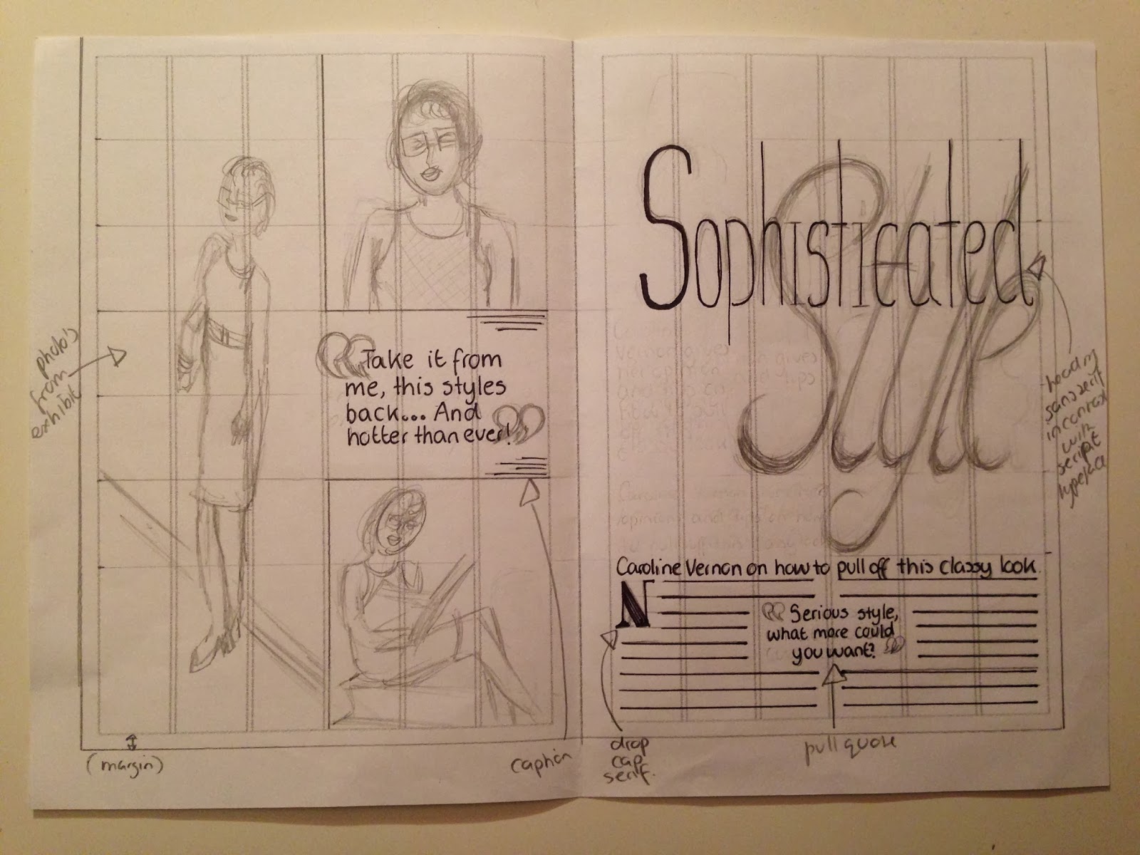
This is how i created by Double page spread.


First i opened Indesign and then scanned my chosen double page spread draft onto the computer. By placing it into Indesign i then could base my design on it easier. I then placed guidelines onto the DPS to help make my design even and similar to the draft. I then locked the draft into place so it wouldn't effect the making of my DPS.


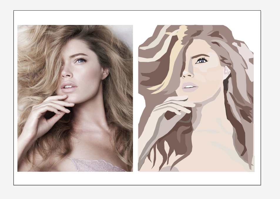
I then started to prepare the photos i will be using from the ones i had taken. I placed them into Photoshop where i began to edit them changing the levels, colour balance, exposure and hue&saturation. This helped make my photo look more natural and professional.


After i had finished editing the photo i then placed in into my Indesign project. By using my grid and draft i placed it precisely in the centre of the page. I enlarged it slightly and changed the framing so she would be posing straight on, making the page's look more even and semetrical. It also helped make the DPS look more connected.


By using the same editing techniques on 2 other photos, i placed them into the project using help from the guides and draft to make sure everything was even. By using the same editing techniques, it also made them link nicely together so it brought the whole DPS together.


Using my draft to help me i also added a title, trying to allow some white space to have some of the page. I also used the curning tool to edit the font slightly to suit the page size. By choosing a sans serif font for the title i thought that the pull quotes should be a contrasting type, so decided to choose a script font. I then chose a serif font for the kicker to further contrast with the sans serif main body text. I also allowed the pull quotes to spread onto the pictures to help break the guides which creates a more interesting and interconnected DPS.


To try and make the title more interesting i decided to enlarge a script type, changing the levels of transparency to contrast with the other title words but consequentially bringing the two words together (I later changed this to an ampersand to make it less complicated and easier to read). I then used the same technique for the quotation marks, making them have a more prominent part to the DPS. 


To make the DPS look more professional i added a drop cap to the start of the text and added captions to the pictures. I also changed the curning and height of the body text to help make it easier to read and consequentially more inviting to read.


I also ensured that there was a limited amount of type on the page so as not to confuse the reader or make it look too cluttered. I used the same type used from my front cover on the kicker and the folios on all comers of the magazine DPS. By creating the folios it ensured my DPS looked professional and inviting. I also make the them stand out by placing a block of colour behind the text. By doing this, it linked the page together and helped give it a tan colour scheme. To help create a interesting trade mark i made the top right corner have the Magazines name in black except for the last letter being white, which helped link it to the rest of the page and connect all the folios together.

This is my final double page spread.


Tuesday 21 January 2014

Draft Double Page Spreads

I have created 3 drafts of what my magazine might look like.


Design No.1


In this design i decided to do a large contrasting heading with the smaller body text. The heading itself also contrasts with each other as one word's typeface is a sans serif and the other a script. I also included pull quotes, a margin, a kicker, captions, photo's from my exhibit and also a drop cap to make it look more professional and appealing to the female audience. I also used whitespace and the photo's i will use will be helpful for women searching for tips.


Design No.2


In this design i have decided to use a continual serif heading, bleeding onto the next page. This helps link the photos to the story i created. I also used pull quotes, photos from my exhibit, a margin,a folio in the top left, a kicker, drop cap and captions for the photos explaining what they are. I also included a ampersand symbol slightly faded behind the heading to make the page more contrasting.


Design No.3

In this design i have chosen to place a large photo in the middle of my page, almost like a mirror of both sides. This helps link the two pages together easily. I also decided to make the heading sans serif to help intensify the feeling of sophistication but a modern style. I also included a kicker, a folio in the top left, pull quotes, drop caps, a margin and a caption to explain my photos. To help make the DPS more diverse i have also varied the size of images i have used.

Contact Sheet

I took a wide range of photos so i would be able to chose my pictures from a varied selection. Ive tried to incorporate different positions and body language to test knew look, or make a more dynamic, interesting photo.

All f the photos selected in blue are the ones i have taken interest in while editing out the ones i was not going to use. For instance the one circled above this text incorporates the background into the picture, drawing attention to other aspects linked with more sophisticated people, like the fire and paintings.
This also occurred with the 2 below this text, incorporating other aspects like the chair and mirror to make it a busier photo, consequentially making it more interesting to the reader.

However the 2 above this pice of text use white space to good effect. It draws attention to her face and the contrasting colour of the green book, making it simple yet striking. It also highlights her face and the glasses which help associate 'geek' into the pictures, making it easier to figure out the article.

The photos circle in red are the ones i have decided to use in my actual magazine. The first one below this text is good and i thought the white space helps my model stand out of the page. Also by lifting the book hiding her face, it creates a certain level of mysteriousness which may intrigue people into reading my article.

The 2 above this text are also effective for the same reason of the white space used. She stands out easily and also helps highlight the classy approach my magazine is taking, by the glossy clean approach it takes. By creating an even light, i saw how it would be easy to edit it into a more natural light but keeping it soft and professional looking.


Vector potrait

This is the image i chose to base my vector portrait on as i thought that it links to my magazine well as it looks professional and is based upon a female model, which would attract the female audience.


I created my vector portrait by opening my photo in illustrator. I then collected 3 base colours i would be using in my picture, and then created a bridge between them, so i had a wider range of tones and colours to work with.

Then, using the pen tool, I drew out the basic shapes of my model, starting by working from the back like the shoulders, and then drawing out the features on top, like the eyes. After drawing out the main features i then added places of tone into the portrait.


After completing the outlines i then started to add colour into my vector portrait from my selection of tones i had previously created.


This is my completed vector portrait in comparison with the actual photo.


Wednesday 15 January 2014

DPS Spread Scamps

Here are some layout ideas i came up with, with some annotations to help me get a clearer image of what it might look like.