Tuesday 26 November 2013

Magazine Research - Examples


I chose these examples as they all have a glossy appeal only seen in fashion/gossip magazines. I went out and searched for ideas which may be useful for me in the designing process of my magazine front page and double page spread.


Magazine Research - Pinterest

These are some ideas of magazines i would like to base my own on through Pinterest. I chose a variety of layouts and styles to help me decide and give me ideas.


Font Type/Styles


Sunday 24 November 2013

Initial ideas for Magazine name


I started with the words Gossip and Style and then branched off idea's. This created a whole range of words which contributed to my Final Magazine name.


Final name : Notorious Beauty

Saturday 23 November 2013

Magazine recreation - Rolling Stones

This is the magazine i recreated using Indesign. 


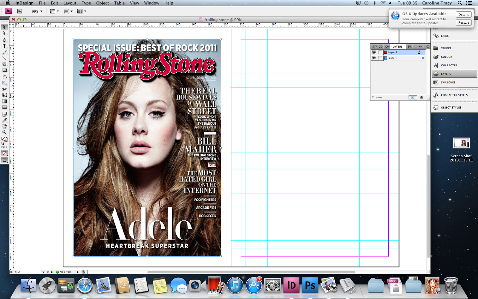
After placing the picture into indesign i created 2 pages so one could be the cover in exact proportion to my own attempt at the cover.
I first placed the actual cover over where i would be creating my own cover. I used the guide lines to help me navigate where everything was positioned exactly.


After this i tried to find a suitable font for the name of the magazine 'Rolling Stone'. When i found a suitable one i installed the font and started manoeuvring it to fit the exact size of the actual title.
Character styles helped me to do this.


Then to create the shadowed effect i used the drop shadow tool to create the exact angle and depth of the shadow i wanted. 


Then i began to do the other texts surrounding the image. After finding the closest font to the original covers i then set character styles. This allowed me to make a pice of text and by clicking the the style i wanted, it would place the exact same effects on the pice of text. This made it a lot faster to build up the cover.


After i had finished doing the text pieces i took a photo to be used for the Adele picture. This was the original picture i took.


I then began to edit the picture in Photoshop to enhance it and make it look more like the original photo on the cover. I used the exposure settings and smoothed her skin to make it appear more like the airbrushed Adele.


I also changed the colour of her eyes from blue to green, so it would be closer to the original picture. I did this by using the brush tool and then changing the opacity so it would look more natural.


This was the picture part way through the editing process.


I then began changing the colour of her skin and the background of my own picture to be better suited to the original.


This is the final version of the picture where i had edited it to allow people to see the similarities between the two.

I then placed it behind the text and this is my final replica of the Rolling Stone Magazine cover.

Friday 22 November 2013

Magazine Recreation - NME


This is the Magazine cover i will be recreated using Indesign.


 After placing guide lines over the original cover to help me replicate it exactly, I started to make boxes in the same position as the orgional cover. After making the first box i made an object style which meant i could make a specific box have the exact same effects as another one, making my task a lot faster.


 Then i started to add text within the boxes after finding a suitable text to fit the font NME used. To help me navigate around my project i crated layers. These decided it up into groups like text's and boxes which made it a lot easier to find things.


Then i took a picture trying to replicate the one in the original Magazine and edit it to make it similar. I cropped and changed some levels in Photoshop to make it a lot better. 
I then placed it underneath my text and changed its sizing so it would fit correctly.


My final replica of the NME magazine cover.


Monday 11 November 2013

'Awesome Comics' card for John Panelreader


Old Card

My Card


I started by using 2 different typefaces so that they contrast with each other, this would be appealing to the eye. Then i started to change the sizes of the text so that there would be more contrast making some information stand out more than other pieces.

Then I made a centre alignment so that it is simple and effective in its aim to catch the attention of someones eye. Then i made the proximity of 2 separate pieces of information quite large so that one says who and what the card is, and the other says about how to contact him.