
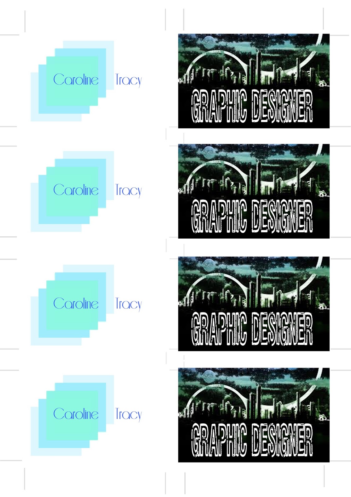
I decided to create 2 different versions of my business card.
I first created one with a black background and contrasting white writing. I then used 3 different types of font to add further contrast to the back of the card, so it would be appealing.
On my second version i decided to create a more classic card version but with a few modern twists like my repeated square fading out. Then using a delicate font i made the information small so it gave it white space which looks appealing at a glance.

The front covers are more simple.
I decided to add an image and a display type font to create a more modern, rough type of card. It lacks the use of white space which was my intention.
In my other card however I've decided to repeat the square pattern and then take advantage of the white space to make the card look more elegant and neat.
My final versions, cut out with a guillotine, to ensure the cards are even and straight.
